Las barras de progreso se han vuelto bastante populares últimamente, y hay muchos complementos que pueden ayudarlo a agregar uno a su sitio. Pero, ¿cómo haces uno tú mismo? El problema es que ya hay muchas implementaciones, por lo que en este tutorial, vamos a codificar algo diferente:botones que tienen medidores de progreso integrados.
Serán perfectos para mostrar el progreso al enviar formularios o cargar contenido a través de AJAX. También usarán estilos y transiciones CSS3 para que sean fáciles de personalizar.
El HTML
En la primera sección del tutorial, escribiremos el marcado HTML. Viene en forma de un documento HTML5 estándar que incluye dos recursos adicionales que discutiremos más adelante:styles.css hoja de estilo y script.js archivo JavaScript. Además, he incluido la biblioteca jQuery y la fuente Raleway de las fuentes web de Google.
index.html
<!DOCTYPE html>
<html>
<head>
<meta charset="utf-8"/>
<title>Tutorial: Buttons with built-in progress meters</title>
<link href="http://fonts.googleapis.com/css?family=Raleway:400,700" rel="stylesheet" />
<!-- The Stylesheets -->
<link href="assets/css/style.css" rel="stylesheet" />
</head>
<body>
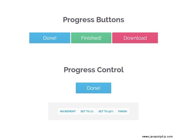
<h1>Progress Buttons</h1>
<a id="submitButton" href="#" class="progress-button">Submit</a>
<a id="actionButton" href="#" class="progress-button green" data-loading="Working.." data-finished="Finished!" data-type="background-bar">Action!</a>
<a id="generateButton" href="#" class="progress-button red" data-loading="Generating.." data-finished="Download" data-type="background-vertical">Generate</a>
<h1>Progress Control</h1>
<a id="controlButton" href="#" class="progress-button">Start</a>
<div class="control-area">
<a class="command increment">Increment</a>
<a class="command set-to-1">Set to 1%</a>
<a class="command set-to-50">Set to 50%</a>
<a class="command finish">Finish</a>
</div>
<script src="http://cdnjs.cloudflare.com/ajax/libs/jquery/1.10.2/jquery.min.js"></script>
<script src="assets/js/script.js"></script>
</body>
</html> El marcado es bastante simple. Los botones de progreso se definen como hipervínculos regulares. Para que el complemento los reconozca y los convierta en botones con barras de progreso integradas, deben tener el .botón de progreso. clase. Los botones también se pueden configurar configurando tres datos-* atributos:
data-typeespecifica qué tipo de barras de progreso se mostrarán. Actualmente se admiten tres tipos:fondo-horizontal (el predeterminado), barra de fondo y fondo-vertical .data-loadingespecifica el texto que se muestra mientras se mueve la barra de progreso. El valor predeterminado es Cargando..data-finishedcontiene el texto que se establece en el botón cuando se realiza el progreso. El valor predeterminado es ¡Listo!
Si omite un atributo, se utilizará el valor predeterminado.
El código jQuery
En esta parte del tutorial, vamos a escribir el código JavaScript y jQuery para que los botones funcionen. El código está organizado como 6 complementos de jQuery que comparten un nombre común:progressInitialize , progressStart , progressIncrement , progressTimed , progressSet y progressFinish . He proporcionado muchos comentarios en el código, por lo que puede profundizar en:
activos/js/script.js
$(document).ready(function(){

    // Convert all the links with the progress-button class to
    // actual buttons with progress meters.
    // You need to call this function once the page is loaded.
    // If you add buttons later, you will need to call the function only for them.

    $('.progress-button').progressInitialize();

    // Listen for clicks on the first three buttons, and start
    // the progress animations

    $('#submitButton').click(function(e){
        e.preventDefault();

        // This function will show a progress meter for
        // the specified amount of time

        $(this).progressTimed(2);
    });

    $('#actionButton').click(function(e){
        e.preventDefault();
        $(this).progressTimed(2);
    });

    $('#generateButton').one('click', function(e){
        e.preventDefault();

        // It can take a callback

        var button = $(this);
        button.progressTimed(3, function(){

            // In this callback, you can set the href attribute of the button
            // to the URL of the generated file. For the demo, we will only
            // set up a new event listener that alerts a message.

            button.click(function(){
                alert('Showing how a callback works!');
            });
        });
    });

    // Custom progress handling

    var controlButton = $('#controlButton');

    controlButton.click(function(e){
        e.preventDefault();

        // You can optionally call the progressStart function.
        // It will simulate activity every 2 seconds if the
        // progress meter has not been incremented.

        controlButton.progressStart();
    });

    $('.command.increment').click(function(){

        // Increment the progress bar with 10%. Pass a number
        // as an argument to increment with a different amount.

        controlButton.progressIncrement();
    });

    $('.command.set-to-1').click(function(){

        // Set the progress meter to the specified percentage

        controlButton.progressSet(1);
    });

    $('.command.set-to-50').click(function(){
        controlButton.progressSet(50);
    });

    $('.command.finish').click(function(){

        // Set the progress meter to 100% and show the done text.
        controlButton.progressFinish();
    });

});

// The progress meter functionality is available as a series of plugins.
// You can put this code in a separate file if you wish to keep things tidy.

(function($){

    // Creating a number of jQuery plugins that you can use to
    // initialize and control the progress meters.

    $.fn.progressInitialize = function(){

        // This function creates the necessary markup for the progress meter
        // and sets up a few event listeners.

        // Loop through all the buttons:

        return this.each(function(){

            var button = $(this),
                progress = 0;

            // Extract the data attributes into the options object.
            // If they are missing, they will receive default values.

            var options = $.extend({
                type:'background-horizontal',
                loading: 'Loading..',
                finished: 'Done!'
            }, button.data());

            // Add the data attributes if they are missing from the element.
            // They are used by our CSS code to show the messages
            button.attr({'data-loading': options.loading, 'data-finished': options.finished});

            // Add the needed markup for the progress bar to the button
            var bar = $('<span class="tz-bar ' + options.type + '">').appendTo(button);

            // The progress event tells the button to update the progress bar
            button.on('progress', function(e, val, absolute, finish){

                if(!button.hasClass('in-progress')){

                    // This is the first progress event for the button (or the
                    // first after it has finished in a previous run). Re-initialize
                    // the progress and remove some classes that may be left.

                    bar.show();
                    progress = 0;
                    button.removeClass('finished').addClass('in-progress')
                }

                // val, absolute and finish are event data passed by the progressIncrement
                // and progressSet methods that you can see near the end of this file.

                if(absolute){
                    progress = val;
                }
                else{
                    progress += val;
                }

                if(progress >= 100){
                    progress = 100;
                }

                if(finish){

                    button.removeClass('in-progress').addClass('finished');

                    bar.delay(500).fadeOut(function(){

                        // Trigger the custom progress-finish event
                        button.trigger('progress-finish');
                        setProgress(0);
                    });

                }

                setProgress(progress);
            });

            function setProgress(percentage){
                bar.filter('.background-horizontal,.background-bar').width(percentage+'%');
                bar.filter('.background-vertical').height(percentage+'%');
            }

        });

    };

    // progressStart simulates activity on the progress meter. Call it first,
    // if the progress is going to take a long time to finish.

    $.fn.progressStart = function(){

        var button = this.first(),
            last_progress = new Date().getTime();

        if(button.hasClass('in-progress')){
            // Don't start it a second time!
            return this;
        }

        button.on('progress', function(){
            last_progress = new Date().getTime();
        });

        // Every half a second check whether the progress
        // has been incremented in the last two seconds

        var interval = window.setInterval(function(){

            if( new Date().getTime() > 2000+last_progress){

                // There has been no activity for two seconds. Increment the progress
                // bar a little bit to show that something is happening

                button.progressIncrement(5);
            }

        }, 500);

        button.on('progress-finish',function(){
            window.clearInterval(interval);
        });

        return button.progressIncrement(10);
    };

    $.fn.progressFinish = function(){
        return this.first().progressSet(100);
    };

    $.fn.progressIncrement = function(val){

        val = val || 10;

        var button = this.first();

        button.trigger('progress',[val])

        return this;
    };

    $.fn.progressSet = function(val){
        val = val || 10;

        var finish = false;
        if(val >= 100){
            finish = true;
        }

        return this.first().trigger('progress',[val, true, finish]);
    };

    // This function creates a progress meter that
    // finishes in a specified amount of time.

    $.fn.progressTimed = function(seconds, cb){

        var button = this.first(),
            bar = button.find('.tz-bar');

        if(button.is('.in-progress')){
            return this;
        }

        // Set a transition declaration for the duration of the meter.
        // CSS will do the job of animating the progress bar for us.

        bar.css('transition', seconds+'s linear');
        button.progressSet(99);

        window.setTimeout(function(){
            bar.css('transition','');
            button.progressFinish();

            if($.isFunction(cb)){
                cb();
            }

        }, seconds*1000);
    };

})(jQuery);
progressInitialize configura un detector de eventos para el evento personalizado de progreso al que llaman las otras funciones cada vez que se necesita actualizar el medidor. Gracias al evento personalizado, podemos tener funciones totalmente independientes como progressStart , que gestiona su propio temporizador y estado - progresInitialize no necesita saber sobre progressStart .
La otra cosa importante es que estamos configurando dos clases especiales en los botones:.in-progress mientras el medidor de progreso se está moviendo, y .finished cuando está listo. Se utilizan para actualizar el texto de los botones como verás en la siguiente sección.
El CSS
Mencioné que estamos configurando dos clases de CSS en los botones:.in-progress y .terminado . Pero, ¿cómo cambia el texto del botón al agregar una de estas clases? Simple:estamos usando un truco CSS que involucra el CSS3 attr operador, que cuando se combina con content , puede establecer el texto de un :before o :después pseudo elemento a la del atributo del elemento. Será más claro una vez que lo veas por ti mismo (líneas 44-52):
activos/css/estilos.css
.progress-button{
    display: inline-block;
    font-size:24px;
    color:#fff !important;
    text-decoration: none !important;
    padding:14px 60px;
    line-height:1;
    overflow: hidden;
    position:relative;

    box-shadow:0 1px 1px #ccc;
    border-radius:2px;

    background-color: #51b7e6;
    background-image:-webkit-linear-gradient(top, #51b7e6, #4dafdd);
    background-image:-moz-linear-gradient(top, #51b7e6, #4dafdd);
    background-image:linear-gradient(top, #51b7e6, #4dafdd);
}

/* Hide the original text of the button. Then the loading or finished
   text will be shown in the :after element above it. */

.progress-button.in-progress,
.progress-button.finished{
    color:transparent !important;
}

.progress-button.in-progress:after,
.progress-button.finished:after{
    position: absolute;
    z-index: 2;
    width: 100%;
    height: 100%;
    text-align: center;
    top: 0;
    padding-top: inherit;
    color: #fff !important;
    left: 0;
}

/* If the .in-progress class is set on the button, show the
   contents of the data-loading attribute on the butotn */

.progress-button.in-progress:after{
    content:attr(data-loading);
}

/* The same goes for the .finished class */

.progress-button.finished:after{
    content:attr(data-finished);
}

/* The colorful bar that grows depending on the progress */

.progress-button .tz-bar{
    background-color:#e667c0;
    height:3px;
    bottom:0;
    left:0;
    width:0;
    position:absolute;
    z-index:1;

    border-radius:0 0 2px 2px;

    -webkit-transition: width 0.5s, height 0.5s;
    -moz-transition: width 0.5s, height 0.5s;
    transition: width 0.5s, height 0.5s;
}

/* The bar can be either horizontal, or vertical */

.progress-button .tz-bar.background-horizontal{
    height:100%;
    border-radius:2px;
}

.progress-button .tz-bar.background-vertical{
    height:0;
    top:0;
    width:100%;
    border-radius:2px;
}
El resto del código diseña los botones y el medidor de progreso incorporado. En estilos.css También he incluido dos temas de color adicionales y algunas otras reglas que no se dan aquí, pero que puedes ver navegando por la fuente tú mismo.
¡Hemos terminado!
El código que escribimos hoy está listo para personalizarse. Simplemente abra styles.css en su editor de código favorito y cambie los colores, las fuentes o los estilos para que coincidan con su sitio. Cambie el texto editando el HTML y los atributos de datos. O incluso puede mejorar el código con alguna característica nueva e interesante. En este caso, asegúrese de compartirlo en la sección de comentarios :)