Dost jsem přemýšlel o tom, jak vývojáři postupují při výběru a učení knihoven grafů. Cítím, že d3.js je pravděpodobně nejvlivnějším nástrojem mezi vývojářskou komunitou pro vytváření interaktivních vizualizací dat. Můj zájem o d3 začal, když jsem začátkem tohoto roku (leden 2020) navštívil stav javascriptových webových stránek. Zamiloval jsem se do způsobu, jakým byly na webu vyvíjeny grafy, protože vysvětlovaly věci, které je opravdu těžké vysvětlit slovy nebo pouhým pohledem na nezpracovaná data.
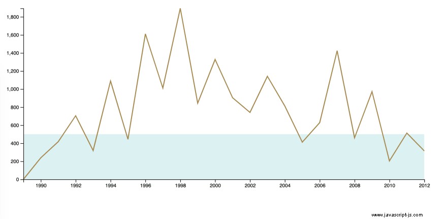
Jsem velkým fanouškem kriketu a Sachin. Chtěl jsem si představit, jak si každý rok vedl od svého debutu až do důchodu. Data, která jsem použil k vytvoření grafu, najdete zde. Sachin data podle roku – github gist.
Konečný výstup vypadá níže
Podívejme se na kroky, jak se tam dostat.
Krok – 1
Stáhněte si nejnovější soubor knihovny d3 a umístěte jej do složky, kde je vytvořen index.html.
<!DOCTYPE html>
<html lang="en">
    <head>
        <title>My Timeline</title>
    </head>
    <body>
        <div id="wrapper"></div>

        <script src="./d3.v5.js"></script>
        <script src="./chart.js"></script>
    </body>
</html>
Krok – 2
Ke spuštění dev serveru v aktuální složce použijte node live-server nebo python SimpleHTTPServer.
live-server // starts the webserver on port 8080
python -m SimpleHTTPServer // start the webserver on port 8000
Krok – 3
Využijme interní funkce d3 ke generování spojnicového grafu. Vysvětlím význam každého řádku s v souboru js.
async function drawLineChart() {

    // 1. Read the data from json
    const dataset = await d3.json("./sachin-by-year.json")

    // 2. Verify if your data is retrieved correctly.
    console.log("what is dataset ", dataset)

    /* 3. Define x and y axis accessor methods
       (x-axis -> Year, y-axis -> runs). Accessor methods
       helps to fetch the to be plotted info from the datapoint.
       Say the datapoint represent an object e.g dataset[0]
       from dataset.
    */
    const yAccessor = d => parseInt(d.runs)
    const dateParser = d3.timeParse("%Y")
    const xAccessor = d => dateParser(parseInt(d.year))

    /*
      4. Define chart dimensions (external border, #wrapper)
         and bounds (internal border, covers axes labels or info
         on the chart). In general the dimensions depend on the
         amount of space we get on the page for the chart.
    */
    let dimensions = {
        width: window.innerWidth * 0.6,
        height: 400,
        margin: {
            top: 15,
            right: 15,
            bottom: 40,
            left: 60,
        },
    }
    dimensions.boundedWidth = dimensions.width -
        dimensions.margin.left -
        dimensions.margin.right
    dimensions.boundedHeight = dimensions.height -
        dimensions.margin.top -
        dimensions.margin.bottom


    /*
       5. Select an external wrapper (for the chart).
       d3's d3-selection module helps in querying
       and manipulating the DOM. (If you are familiar with
       JQuery module methods, this module doco is easy
       to understand).
    */
    const wrapper = d3.select("#wrapper")
        .append("svg")
        .attr("width", dimensions.width)
        .attr("height", dimensions.height)

    /*
      Note: This explanation is copied from book. FYI

      The <g> SVG element is not visible on its own, but
      is used to group other elements. Think of it as the
      <div> of SVG — a wrapper for other elements. We can
      draw our chart inside of a <g> element and shift it
      all at once using the CSS transform property.
    */
    const bounds = wrapper.append("g")
        .style("transform", `translate(${
        dimensions.margin.left
      }px, ${
        dimensions.margin.top
      }px)`)

    // 6. Define scales (x and y scales)
    const yScale = d3.scaleLinear()
        .domain(d3.extent(dataset, yAccessor))
        .range([dimensions.boundedHeight, 0])

    /*
       I want to understand the years when sachin
       Scored just 500 runs in a year. (Area with light
       blue colour in the graph depicts that)
    */
    const runsLessThan500InAYear = yScale(500)
    const runsLessThan500 = bounds.append("rect")
        .attr("x", 0)
        .attr("width", dimensions.boundedWidth)
        .attr("y", runsLessThan500InAYear)
        .attr("height", dimensions.boundedHeight
            - runsLessThan500InAYear)
        .attr("fill", "#e0f3f3")

    // x axis defines years from 1989 to 2012
    /*
      Note: I thought of using x axis labels as scaleLinear()
      but the problem with that was labels were treated as numbers
      and the display was like 1,998, 1,999 etc which is wrong.
      Hence i used date parser to show the labels like years.May be
      there is a better way to do this.
    */
    const xScale = d3.scaleTime()
        .domain(d3.extent(dataset, xAccessor))
        .range([0, dimensions.boundedWidth])

    // 7. Map data points now
    const lineGenerator = d3.line()
        .x(d => xScale(xAccessor(d)))
        .y(d => yScale(yAccessor(d)))

    /*
       Use 'attr' or 'style' methods to add css

       Note: As this is a simple example, CSS and JS are
       mixed.
    */
    const line = bounds.append("path")
        .attr("d", lineGenerator(dataset))
        .attr("fill", "none")
        .attr("stroke", "#af9358")
        .attr("stroke-width", 2)

    // 8. Draw bounds (x and y both axes)
    const yAxisGenerator = d3.axisLeft()
        .scale(yScale)

    const yAxis = bounds.append("g")
        .call(yAxisGenerator)

    const xAxisGenerator = d3.axisBottom()
        .scale(xScale)

    /*
     d3 don't know where to place the axis
     line and hence the transform property required to
     place it where we want. In this case we displace it
     along y axis by boundedHeight.
    */
    const xAxis = bounds.append("g")
        .call(xAxisGenerator)
        .style("transform", `translateY(${
        dimensions.boundedHeight
      }px)`)

}
drawLineChart()
Závěr
Nemám dostatek vývojářských zkušeností s d3, abych to mohl porovnat s knihovnami grafů a poskytnout výhody. Můj další krok je ušpinit si ruce s d3 knihovnou čtením knihy Amelie Wattenberger :P. Úryvky kódu budu sdílet, jakmile se naučím koncept v knize prostřednictvím článků dev.to :).
Budu rád za konstruktivní zpětnou vazbu k článku. Podělte se prosím o své zkušenosti s d3 a jakýmikoli dobrými knihami, abyste se naučili toto téma.
Děkuji :)